How to Make a PowerPoint Presentation Slides: Quick & Easy Tips
Wondering how to make a PowerPoint presentation slides for your final year project defense?
- You’re not alone
PowerPoint presentation slides are a great way to deliver a project defense, attract audience attention on a subject and support complicated concepts in your project work.
However, a bad presentation can achieve the opposite. Poorly designed PowerPoint presentation slides with bad graphics or too much text can distract or worse, irritate the audience.
In this post on How to Make a PowerPoint Presentation Slides, I have listed out short guide that will help you create PowerPoint slides with a professional look and concise content, avoiding the most common mistakes.
How to Make a PowerPoint Presentation Slides
By searching Google for free PowerPoint presentation templates, you can find a large selection of templates for a variety of topics. However, whether you download a free template, use PowerPoint maker or create your own, keep the following PowerPoint presentation tips in mind:
Slide 1 | Introductory slide

- Enter your MATRIC number and your project topic in the first field.
- Enter your name and supervisor’s name and / or school information in the second field.
Slide 2 | Information slide

- Main content of your presentation in a One-Column Format.
- Copy and insert this slide as many times as needed for your content.
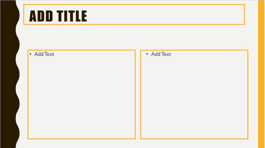
Slide 3 | Information slide

- Main content of your presentation in a Two-Column Format.
- Copy and insert this slide as many times as needed for your content.
Slide 4 | Acknowledgement, thank you, questions in a One-Column Format
- This slide should be displayed during your Q&A time.
Professional PowerPoint Presentation Tips for Your Project Defense
General Presentation Tips
- Your PowerPoint presentation slides orientation should be landscape.
- Use action words to emphasize your key points and not complete sentences.
- Check the spelling and grammatical errors. If possible give out your powerpoint slides to someone for a review
- Keep in mind the time allowed for your presentation. A good rule of thumb is 1-2 slides per minute.
- Have bulleted points appear one at a time so your audience listens to you rather than reading your slides.
- Rule of 666
– No more than 6 bullet points per slide
– No more than 6 words per bullet point
– Every 6th slide should have a graphic
Speaking Tips
- Give a brief overview at the start, present the information and wrap up by reviewing important points.
- Do not read the presentation (verbatim). Practice the presentation so you can speak from bullet points. The text should be a cue for the presenter and not a message for the viewer.
- Use a pointer so you can move around as you speak.
- If sound effects are used, wait until the sound has finished before speaking.
- Do not back your audience.
Fonts Style
- Avoid fonts that are sometimes more difficult to read like serif fonts such as Times New Roman or Palatino. Select sans-serif fonts such as Arial or Helvetica.
- Use a single font for most of the presentation. Use different colors, sizes, and styles (bold, underlined) for impact.
- Avoid italicized fonts as they are difficult to read quickly.
- Do not use all caps except for titles.
- Use font size 24 or larger:
– Titles 40-48 pt
– Subtitles 28-36 pt
– Body Type 24-36 pt
HINT: To test the font, stand back six feet from the monitor and see if you can read the slide.
Color
- Limit the number of colors on each slide.
- Bright colors make small objects and thin lines stand out. However, some vibrant colors are difficult to read when projected.
- Use no more than four colors on one chart.
- Ensure strong color contrast between the background and text to make the presentation easy to read.
- Check all colors on a projection screen before the actual presentation. They may project differently than what appears on the monitor.
- Use dark text on light background or light text on dark background.
Graphics and PowerPoint Design
- Keep the background consistent and subtle.
- Use only enough text when using charts or graphs to clearly explain and label the graphic.
- Keep the design clean and uncluttered. Leave space around the text and graphics.
- Use quality visuals that relate to and enhance the topic of the slide:
– Bar charts compare data
– Line graphs visualize trends
– Box charts illustrate makeup of an organization
– Pie charts emphasize the relationship of parts of the whole
– Photographs and animation clips best depict realism - Try to use the same style graphics throughout the presentation (e.g. cartoon, photographs).
- Limit the number of graphics or animations on each slide.
- Check all graphics on a projection screen before the actual presentation.
- Avoid flashy graphics and noisy animation effects unless they relate directly to the side.
- Limit the number of transitions used. It is often better to use only one so the audience knows what to expect.
NOTE: The first thing that gives a professional touch to any PowerPoint presentation is the design.
What do you think about this great PowerPoint presentation tips? Have you used it before? Let me hear your thoughts in the comments below!
Like this post: How to Make a PowerPoint Presentation Slides? Don’t forget to share it!


